Telehealth Performance and Quality Improvement Toolkit Users Guide
This guide helps you to utilize the telehealth performance and quality improvement toolkit. Each widget represents different visualizations of data that helps you understand the stats and identify patterns.
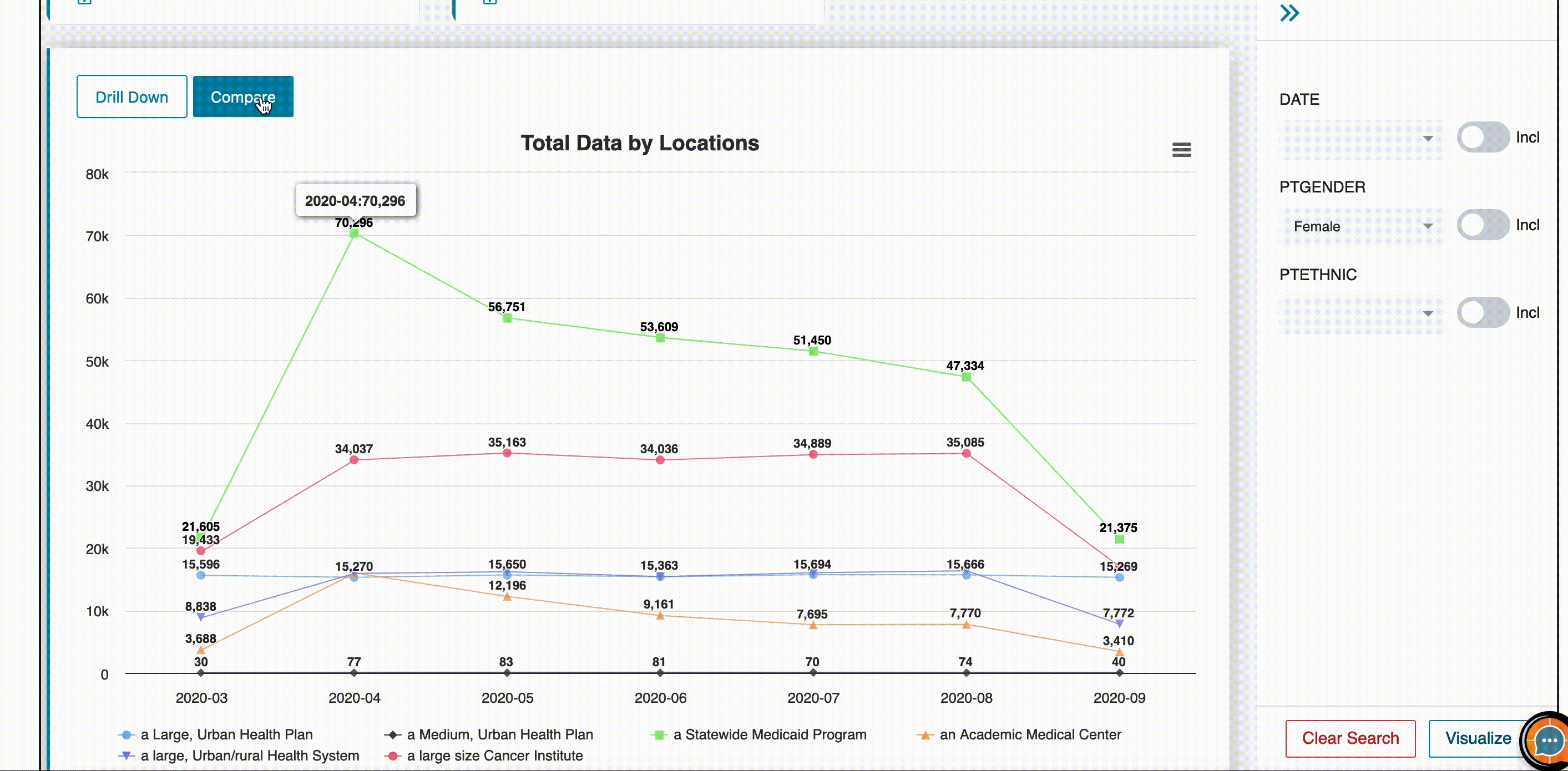
Filtering Dashboard
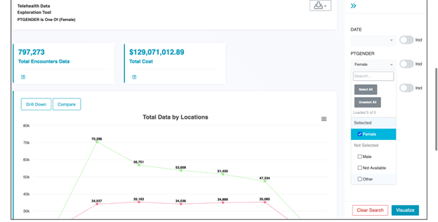
The tool’s "Filters" feature enables you to refine data selection with precision and extract meaningful insights. Using Filters, you can focus on the data that matters most to your analysis. Whether you want to hone in on specific patient demographics, filter data within a specific date range, or segment information based on geographical regions, the tool empowers you to identify trends and patterns within just a few clicks.
Once the filters are applied, all the widgets on the dashboard will start displaying data specific to the filters.
How to:
- On the right panel of the dashboard, select from the given filter “Date, Gender or Ethnic”, and click the “Visualize” button at the bottom to allow the tool to filter the data and display widgets accordingly.
- Click the “Clear Search” button to remove the filters.
For example, upon clicking the PTGender filter and selecting "Female" as the filter, the telehealth tool will refresh widgets and now display the number of encounters, the total cost of those encounters and relevant metrics only for encounters where the patient is female.
Drilldown Widgets
The "Drill Down" function enhances data exploration by allowing users to dissect data interactively. It's available in the dashboard alongside widgets with charts. This feature enables interactive data slicing and dicing, letting users break down visualizations into granular components and zoom in on specific data subsets for deeper understanding.
Users can navigate between dimensions like time, geography, demographics, or other relevant attributes with a few clicks.
How to:
- On the “Total data by locations” widget, at the top left corner, click the “Drilldown” button.
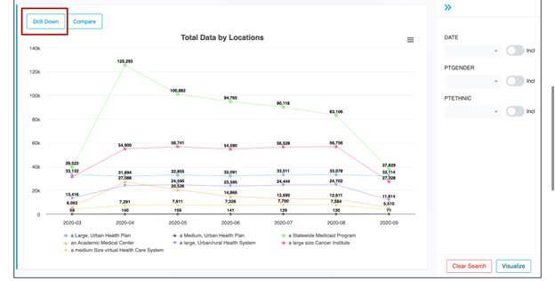
- Upon clicking, you can change the type of visualization by selecting from list of widgets available.
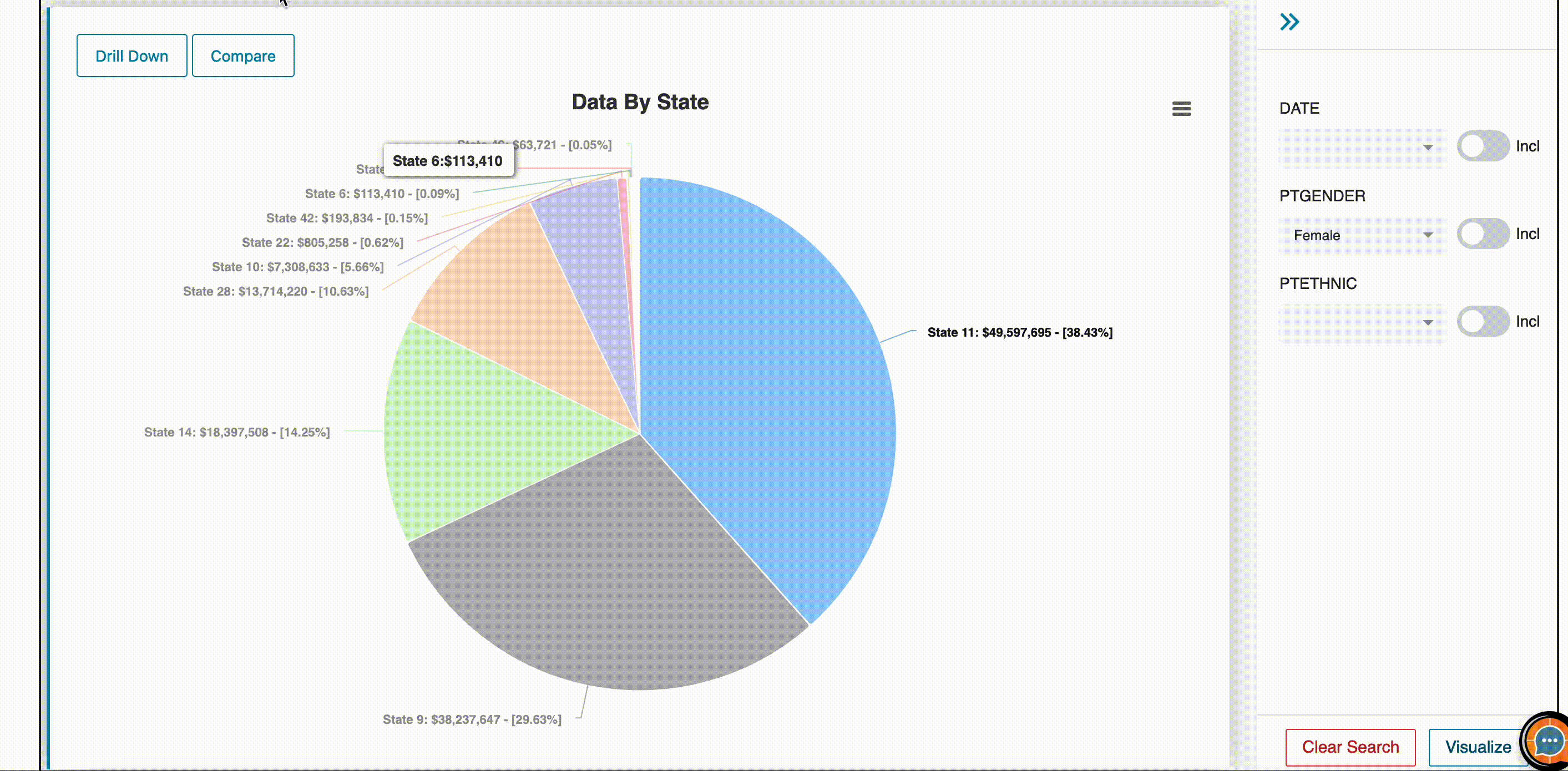
- Select the part where more granular data is needed such as a pie chart displaying data by state, the user clicks on the pie section of state 11 as a particular data selection and slices it into displaying a column chart of state 11’s data by age field.
Compare Widgets
The tool allows users to compare widgets over multiple metrics at the same time.
Metrics: Metrics encompass a wide range of measures, calculations, and aggregates. Whether it's the average duration of patient encounters, total cost, or other telehealth specific metric library.
By comparing widgets, users can identify trends, monitor performance, and track key indicators.
How to:
- Click the “Compare” button to open the widget in compare mode.
- Select the metric for the first widget, and then select the metric to be compared from the list of metrics available.
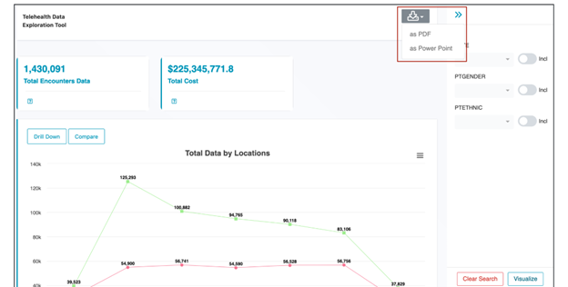
Downloading Dashboard
This tool also allows users to download the entire dashboard for their convenience.
How to:
- Click the “Download Report” button at the upper right corner.
- Select the type of download from the options given.